What Screens Want

Metadata
Highlights
- What does it mean to natively design for screens? (View Highlight)
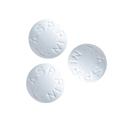 These are aspirin pills. I’m not big on medicating, so my aspirin purchase was the first in a long time. When I rattled a few of the pills out of the bottle, I noticed they seemed to be a lot smaller than I remembered.
I went online to see what was going on. It seems pharmaceutical companies have been able to make the active drug in aspirin more effective in the past few decades. The tiny aspirin pills are hardly aspirin at all, and the drug’s current version is so potent and physically minuscule that it must be padded with a filler substance to make the pill large enough to pick up and put in your mouth. Literally, you couldn’t grasp it without the padding.
When I read that, it occurred to me that we’ve been living through a similar situation with computers. I mean, have you looked at technology recently and taken stock? Things have changed under us. We take it for granted, because the transition was so fast and thorough. (View Highlight)
These are aspirin pills. I’m not big on medicating, so my aspirin purchase was the first in a long time. When I rattled a few of the pills out of the bottle, I noticed they seemed to be a lot smaller than I remembered.
I went online to see what was going on. It seems pharmaceutical companies have been able to make the active drug in aspirin more effective in the past few decades. The tiny aspirin pills are hardly aspirin at all, and the drug’s current version is so potent and physically minuscule that it must be padded with a filler substance to make the pill large enough to pick up and put in your mouth. Literally, you couldn’t grasp it without the padding.
When I read that, it occurred to me that we’ve been living through a similar situation with computers. I mean, have you looked at technology recently and taken stock? Things have changed under us. We take it for granted, because the transition was so fast and thorough. (View Highlight)- So just like the aspirin, we’ve made the guts of our computers more potent, powerful, and smaller. Chances are your computer’s footprint is entirely comprised of its screen. Even an iMac is just a screen with a kickstand. And now, because of touch screens, we’re using the screens for input as well as output. The whole feedback cycle of using a computer is entirely screen-based. It’s no wonder that the average person’s conception of a computer is the screen.
So, if computers are like aspirin, and we’ve been making the computers smaller and smaller, where’s the necessary padding that allows us to grasp things? I stumbled over the question for a while. Then it hit me.
The padding isn’t around the screens. It’s in them. (View Highlight)
- Note: “where is the padding?” as a way to question how people use things
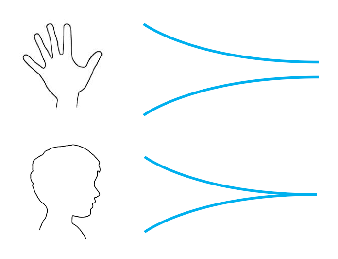 The best way to understand why is to look at the differences between your hands and your brain. Your hands can’t change size, but your mind can: if you’re paying attention, your brain becomes more keen to experiences over time. So while the size of an aspirin pill is constrained by your stubby little fingers, your brain can normalize the patterns of an interface and make way for more nuanced abstractions. With enough time and exposure, a user can shed the padding and metaphors that become dead weight, like taking the training wheels off a bike. (View Highlight)
- I’d like to show you a video clip from a BBC series called Connections, hosted and written by James Burke.
Your browser does not support the video tag.
Sound familiar? The progression of plastics is the same as screens and software. It’s a pattern of malleable mediums: if something can be anything, it usually becomes everything. (View Highlight)
- When Burke talks about things needing to look like their old embodiments and the ability for those shapes to change, he’s talking about skeuomorphs. But he’d never use that word, because he’s much too clever. The word sticks in your mouth, right? Both halves come from Greek.
skeuo → container
morph → shape
So, skeuomorphs are about the shape we choose for the containers we build. This requires plasticity. Softness. Screens are a special material without much precedent, save plastic. And I think it’s best to view screens as a material for interaction and interface design. (View Highlight)
- Just like any material, screens have affordances. Much like wood, I believe screens have grain: a certain way they’ve grown and matured that describes how they want to be treated. The grain is what gives the material its identity and tells you the best way to use it. Figure out the grain, and you know how to natively design for screens. (View Highlight)
- So how do you figure out that grain? Well, if you think about it, the grain of wood is documentation of how the tree has grown. Maybe the best thing to do is to figure out where screens came from. (View Highlight)
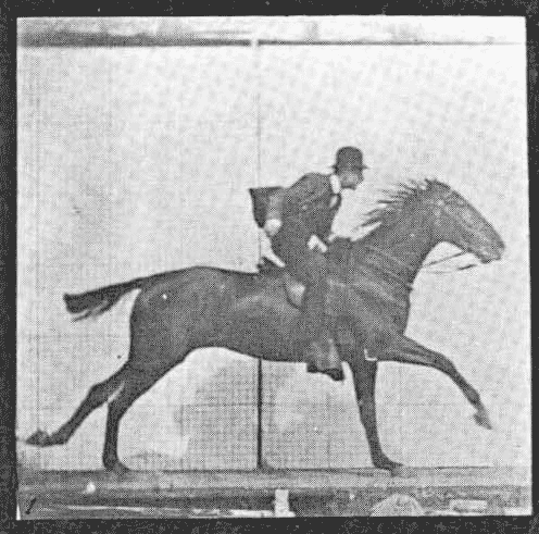 This is the photo, and I think it is probably familiar to quite a few of you. It was taken by a British man named Eadweard Muybridge, who lived in San Francisco and often found himself working in an area we now call Silicon Valley. The photo was staged at a horse track in Palo Alto, just a little bit away from the old Facebook headquarters. The photo on its own isn’t extraordinary, but there isn’t just one photo.
Muybridge took twelve, all taken in the span of just a few seconds.
This is the photo, and I think it is probably familiar to quite a few of you. It was taken by a British man named Eadweard Muybridge, who lived in San Francisco and often found himself working in an area we now call Silicon Valley. The photo was staged at a horse track in Palo Alto, just a little bit away from the old Facebook headquarters. The photo on its own isn’t extraordinary, but there isn’t just one photo.
Muybridge took twelve, all taken in the span of just a few seconds.
 The photos were originally taken to settle a gentlemen’s bet to see if all four of a horse’s hooves were off the ground at any point in their stride. (They were.) Aside from bets, the project had profound effects on time and movement. See, Muybridge’s little photo project was the first time we ever split the second. We all think splitting the atom is important because we can see the consequences, but I think slicing the second is just as profound.
Splitting time so thinly has its advantages. Because when you take those twelve photos and put them in rapid sequence, they do this:
The photos were originally taken to settle a gentlemen’s bet to see if all four of a horse’s hooves were off the ground at any point in their stride. (They were.) Aside from bets, the project had profound effects on time and movement. See, Muybridge’s little photo project was the first time we ever split the second. We all think splitting the atom is important because we can see the consequences, but I think slicing the second is just as profound.
Splitting time so thinly has its advantages. Because when you take those twelve photos and put them in rapid sequence, they do this:
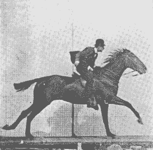 This might not seem like such a big deal to us now, but photography up until that point required the subject to stay extremely still to keep the photograph from blurring. People smiled in the 19th century, but you’d never know it from the photos. It meant that before Muybridge, photographs could refer to life, but never capture its essence: movement. (View Highlight)
- it becomes apparent that web and interaction design are just as much children of filmmaking as they are of graphic design. Maybe even more so. After all, we both work on screens, and manage time, movement, and most importantly, change. So what does all of this mean? I think the grain of screens has been there since the beginning. It’s not tied to an aesthetic. Screens don’t care what the horses look like. They just want them to move. They want the horses to change.
Designing for screens is managing that change. To put a finer head on it, the grain of screens is something I call flux.
Flux is the capacity for change.
Yes, this could be animation, because that’s what I’ve been talking about up until now, but I think it’s a lot more, too. Flux is a generous definition. It encompasses many of the things we take for granted in the digital realm: structural changes, like customization, responsiveness, and variability. (View Highlight)
- A designer’s work is not only about how the things look, but also their behaviors in response to interaction, and the adjustments they make between their fixed states. In fact, designing the way elements adapt and morph in the in-between moments is half of your work as a designer. You’re crafting the interstitials. (View Highlight)
 We need to work as a community to develop a language of transformation so we can talk to one another. And we probably need to steal these words from places like animation, theater, puppetry, dance, and choreography. Words matter. They are abstractions, too—an interface to thought and understanding by communication. The words we use mold our perception of our work and the world around us. They become a frame, just like the interfaces we design. (View Highlight)
- When I realized that, a little light went off in my head: a map’s biases do service to one need, but distort everything else. Meaning, they misinform and confuse those with different needs.
That’s how I feel about the web these days. We have a map, but it’s not for me. So I am distanced. It feels like things are distorted. I am consistently confused.
See, we have our own abstractions on the web, and they are bigger than the user interfaces of the websites and apps we build. They are the abstractions we use to define the web. The commercial web. The things that have sprung up in the last decade, but gained considerable speed in the past five years.
It’s the business structures and funding models we use to create digital businesses. It’s the pressure to scale, simply because it’s easy to copy bits. It’s the relationships between the people who make the stuff, and the people who use that stuff, and the consistent abandonment of users by entrepreneurs.
It’s the churning and the burning, flipping companies, nickel-and-diming users with in-app purchases, data lock-in, and designing with dark patterns so that users accidentally do actions against their own self-interest. (View Highlight)
- We used to have a map of a frontier that could be anything. The web isn’t young anymore, though. It’s settled. It’s been prospected and picked through. Increasingly, it feels like we decided to pave the wilderness, turn it into a suburb, and build a mall. And I hate this map of the web, because it only describes a fraction of what it is and what’s possible. We’ve taken an opportunity for connection and distorted it to commodify attention. That’s one of the sleaziest things you can do. (View Highlight)
- The land comes at the cost of the sea, remember? Maps support the values of those who make them, and distort everything else. So, if your goal is a poker game for rich old white guys, we’ve got a fantastic map right now. I think it’s in all of our best interests to get working on a new vision for the web, and a new role for technology.
We can produce a vision of the web that isn’t based on consolidation, privatization, power hierarchies, and surveillance. We can make a new map. Or maybe reclaim a map we misplaced a long time ago. One built on: extensibility, openness, communication, community, wildness.
We can use the efficiency and power of interfaces to help people do what they already wish more quickly or enjoyably, and we can build up business structures so that it’s okay for people to put down technology and get on with their life once their job is done. We can rearrange how we think about the tools we build, so that someone putting down your tool doesn’t disprove its utility, but validates its usefulness. (View Highlight)
- People believe there’s an essence to the computer, that there’s something true and real and a correct way to do things. But—there is no right way. We get to choose how to aim the technology we build. At least for now, because increasingly, technology feels like something that happens to you instead of something you use. We need to figure out how to stop that, for all of our sakes, before we’re locked in, on rails, and headed toward who knows what.
One of the reasons that I’m so fascinated by screens is because their story is our story. First there was darkness, and then there was light. And then we figured out how to make that light dance. Both stories are about transformations, about change. Screens have flux, and so do we.
So the pep talk is that things are starting to suck, but there’s a capacity for change in what we’ve made, who we are, and what we believe. Everything was made, and if we want, we can remake it how we see fit. We only need to want it.
And then we have to build it. (View Highlight)
title: “What Screens Want”
author: “Frank Chimero”
url: ”https://frankchimero.com/blog/2013/what-screens-want/”
date: 2023-07-29
source: reader
tags: media/articles
What Screens Want
Metadata
Highlights
- What does it mean to natively design for screens? (View Highlight)
-
These are aspirin pills. I’m not big on medicating, so my aspirin purchase was the first in a long time. When I rattled a few of the pills out of the bottle, I noticed they seemed to be a lot smaller than I remembered.
I went online to see what was going on. It seems pharmaceutical companies have been able to make the active drug in aspirin more effective in the past few decades. The tiny aspirin pills are hardly aspirin at all, and the drug’s current version is so potent and physically minuscule that it must be padded with a filler substance to make the pill large enough to pick up and put in your mouth. Literally, you couldn’t grasp it without the padding.
When I read that, it occurred to me that we’ve been living through a similar situation with computers. I mean, have you looked at technology recently and taken stock? Things have changed under us. We take it for granted, because the transition was so fast and thorough. (View Highlight)
- So just like the aspirin, we’ve made the guts of our computers more potent, powerful, and smaller. Chances are your computer’s footprint is entirely comprised of its screen. Even an iMac is just a screen with a kickstand. And now, because of touch screens, we’re using the screens for input as well as output. The whole feedback cycle of using a computer is entirely screen-based. It’s no wonder that the average person’s conception of a computer is the screen.
So, if computers are like aspirin, and we’ve been making the computers smaller and smaller, where’s the necessary padding that allows us to grasp things? I stumbled over the question for a while. Then it hit me.
The padding isn’t around the screens. It’s in them. (View Highlight)
- Note: “where is the padding?” as a way to question how people use things
-
The best way to understand why is to look at the differences between your hands and your brain. Your hands can’t change size, but your mind can: if you’re paying attention, your brain becomes more keen to experiences over time. So while the size of an aspirin pill is constrained by your stubby little fingers, your brain can normalize the patterns of an interface and make way for more nuanced abstractions. With enough time and exposure, a user can shed the padding and metaphors that become dead weight, like taking the training wheels off a bike. (View Highlight)
- I’d like to show you a video clip from a BBC series called Connections, hosted and written by James Burke.
Your browser does not support the video tag.
Sound familiar? The progression of plastics is the same as screens and software. It’s a pattern of malleable mediums: if something can be anything, it usually becomes everything. (View Highlight)
- When Burke talks about things needing to look like their old embodiments and the ability for those shapes to change, he’s talking about skeuomorphs. But he’d never use that word, because he’s much too clever. The word sticks in your mouth, right? Both halves come from Greek.
skeuo → container
morph → shape
So, skeuomorphs are about the shape we choose for the containers we build. This requires plasticity. Softness. Screens are a special material without much precedent, save plastic. And I think it’s best to view screens as a material for interaction and interface design. (View Highlight)
- Just like any material, screens have affordances. Much like wood, I believe screens have grain: a certain way they’ve grown and matured that describes how they want to be treated. The grain is what gives the material its identity and tells you the best way to use it. Figure out the grain, and you know how to natively design for screens. (View Highlight)
- So how do you figure out that grain? Well, if you think about it, the grain of wood is documentation of how the tree has grown. Maybe the best thing to do is to figure out where screens came from. (View Highlight)
-
This is the photo, and I think it is probably familiar to quite a few of you. It was taken by a British man named Eadweard Muybridge, who lived in San Francisco and often found himself working in an area we now call Silicon Valley. The photo was staged at a horse track in Palo Alto, just a little bit away from the old Facebook headquarters. The photo on its own isn’t extraordinary, but there isn’t just one photo.
Muybridge took twelve, all taken in the span of just a few seconds.
The photos were originally taken to settle a gentlemen’s bet to see if all four of a horse’s hooves were off the ground at any point in their stride. (They were.) Aside from bets, the project had profound effects on time and movement. See, Muybridge’s little photo project was the first time we ever split the second. We all think splitting the atom is important because we can see the consequences, but I think slicing the second is just as profound.
Splitting time so thinly has its advantages. Because when you take those twelve photos and put them in rapid sequence, they do this:
This might not seem like such a big deal to us now, but photography up until that point required the subject to stay extremely still to keep the photograph from blurring. People smiled in the 19th century, but you’d never know it from the photos. It meant that before Muybridge, photographs could refer to life, but never capture its essence: movement. (View Highlight)
- it becomes apparent that web and interaction design are just as much children of filmmaking as they are of graphic design. Maybe even more so. After all, we both work on screens, and manage time, movement, and most importantly, change. So what does all of this mean? I think the grain of screens has been there since the beginning. It’s not tied to an aesthetic. Screens don’t care what the horses look like. They just want them to move. They want the horses to change.
Designing for screens is managing that change. To put a finer head on it, the grain of screens is something I call flux.
Flux is the capacity for change.
Yes, this could be animation, because that’s what I’ve been talking about up until now, but I think it’s a lot more, too. Flux is a generous definition. It encompasses many of the things we take for granted in the digital realm: structural changes, like customization, responsiveness, and variability. (View Highlight)
- A designer’s work is not only about how the things look, but also their behaviors in response to interaction, and the adjustments they make between their fixed states. In fact, designing the way elements adapt and morph in the in-between moments is half of your work as a designer. You’re crafting the interstitials. (View Highlight)
-
We need to work as a community to develop a language of transformation so we can talk to one another. And we probably need to steal these words from places like animation, theater, puppetry, dance, and choreography. Words matter. They are abstractions, too—an interface to thought and understanding by communication. The words we use mold our perception of our work and the world around us. They become a frame, just like the interfaces we design. (View Highlight)
- When I realized that, a little light went off in my head: a map’s biases do service to one need, but distort everything else. Meaning, they misinform and confuse those with different needs.
That’s how I feel about the web these days. We have a map, but it’s not for me. So I am distanced. It feels like things are distorted. I am consistently confused.
See, we have our own abstractions on the web, and they are bigger than the user interfaces of the websites and apps we build. They are the abstractions we use to define the web. The commercial web. The things that have sprung up in the last decade, but gained considerable speed in the past five years.
It’s the business structures and funding models we use to create digital businesses. It’s the pressure to scale, simply because it’s easy to copy bits. It’s the relationships between the people who make the stuff, and the people who use that stuff, and the consistent abandonment of users by entrepreneurs.
It’s the churning and the burning, flipping companies, nickel-and-diming users with in-app purchases, data lock-in, and designing with dark patterns so that users accidentally do actions against their own self-interest. (View Highlight)
- We used to have a map of a frontier that could be anything. The web isn’t young anymore, though. It’s settled. It’s been prospected and picked through. Increasingly, it feels like we decided to pave the wilderness, turn it into a suburb, and build a mall. And I hate this map of the web, because it only describes a fraction of what it is and what’s possible. We’ve taken an opportunity for connection and distorted it to commodify attention. That’s one of the sleaziest things you can do. (View Highlight)
- The land comes at the cost of the sea, remember? Maps support the values of those who make them, and distort everything else. So, if your goal is a poker game for rich old white guys, we’ve got a fantastic map right now. I think it’s in all of our best interests to get working on a new vision for the web, and a new role for technology.
We can produce a vision of the web that isn’t based on consolidation, privatization, power hierarchies, and surveillance. We can make a new map. Or maybe reclaim a map we misplaced a long time ago. One built on: extensibility, openness, communication, community, wildness.
We can use the efficiency and power of interfaces to help people do what they already wish more quickly or enjoyably, and we can build up business structures so that it’s okay for people to put down technology and get on with their life once their job is done. We can rearrange how we think about the tools we build, so that someone putting down your tool doesn’t disprove its utility, but validates its usefulness. (View Highlight)
- People believe there’s an essence to the computer, that there’s something true and real and a correct way to do things. But—there is no right way. We get to choose how to aim the technology we build. At least for now, because increasingly, technology feels like something that happens to you instead of something you use. We need to figure out how to stop that, for all of our sakes, before we’re locked in, on rails, and headed toward who knows what.
One of the reasons that I’m so fascinated by screens is because their story is our story. First there was darkness, and then there was light. And then we figured out how to make that light dance. Both stories are about transformations, about change. Screens have flux, and so do we.
So the pep talk is that things are starting to suck, but there’s a capacity for change in what we’ve made, who we are, and what we believe. Everything was made, and if we want, we can remake it how we see fit. We only need to want it.
And then we have to build it. (View Highlight)
title: “What Screens Want”
author: “Frank Chimero”
url: ”https://frankchimero.com/blog/2013/what-screens-want/”
date: 2023-12-19
source: reader
tags: media/articles
What Screens Want
Metadata
Highlights
- What does it mean to natively design for screens? (View Highlight)
-
These are aspirin pills. I’m not big on medicating, so my aspirin purchase was the first in a long time. When I rattled a few of the pills out of the bottle, I noticed they seemed to be a lot smaller than I remembered.
I went online to see what was going on. It seems pharmaceutical companies have been able to make the active drug in aspirin more effective in the past few decades. The tiny aspirin pills are hardly aspirin at all, and the drug’s current version is so potent and physically minuscule that it must be padded with a filler substance to make the pill large enough to pick up and put in your mouth. Literally, you couldn’t grasp it without the padding.
When I read that, it occurred to me that we’ve been living through a similar situation with computers. I mean, have you looked at technology recently and taken stock? Things have changed under us. We take it for granted, because the transition was so fast and thorough. (View Highlight)
- So just like the aspirin, we’ve made the guts of our computers more potent, powerful, and smaller. Chances are your computer’s footprint is entirely comprised of its screen. Even an iMac is just a screen with a kickstand. And now, because of touch screens, we’re using the screens for input as well as output. The whole feedback cycle of using a computer is entirely screen-based. It’s no wonder that the average person’s conception of a computer is the screen.
So, if computers are like aspirin, and we’ve been making the computers smaller and smaller, where’s the necessary padding that allows us to grasp things? I stumbled over the question for a while. Then it hit me.
The padding isn’t around the screens. It’s in them. (View Highlight)
- Note: “where is the padding?” as a way to question how people use things
-
The best way to understand why is to look at the differences between your hands and your brain. Your hands can’t change size, but your mind can: if you’re paying attention, your brain becomes more keen to experiences over time. So while the size of an aspirin pill is constrained by your stubby little fingers, your brain can normalize the patterns of an interface and make way for more nuanced abstractions. With enough time and exposure, a user can shed the padding and metaphors that become dead weight, like taking the training wheels off a bike. (View Highlight)
- I’d like to show you a video clip from a BBC series called Connections, hosted and written by James Burke.
Your browser does not support the video tag.
Sound familiar? The progression of plastics is the same as screens and software. It’s a pattern of malleable mediums: if something can be anything, it usually becomes everything. (View Highlight)
- When Burke talks about things needing to look like their old embodiments and the ability for those shapes to change, he’s talking about skeuomorphs. But he’d never use that word, because he’s much too clever. The word sticks in your mouth, right? Both halves come from Greek.
skeuo → container
morph → shape
So, skeuomorphs are about the shape we choose for the containers we build. This requires plasticity. Softness. Screens are a special material without much precedent, save plastic. And I think it’s best to view screens as a material for interaction and interface design. (View Highlight)
- Just like any material, screens have affordances. Much like wood, I believe screens have grain: a certain way they’ve grown and matured that describes how they want to be treated. The grain is what gives the material its identity and tells you the best way to use it. Figure out the grain, and you know how to natively design for screens. (View Highlight)
- So how do you figure out that grain? Well, if you think about it, the grain of wood is documentation of how the tree has grown. Maybe the best thing to do is to figure out where screens came from. (View Highlight)
-
This is the photo, and I think it is probably familiar to quite a few of you. It was taken by a British man named Eadweard Muybridge, who lived in San Francisco and often found himself working in an area we now call Silicon Valley. The photo was staged at a horse track in Palo Alto, just a little bit away from the old Facebook headquarters. The photo on its own isn’t extraordinary, but there isn’t just one photo.
Muybridge took twelve, all taken in the span of just a few seconds.
The photos were originally taken to settle a gentlemen’s bet to see if all four of a horse’s hooves were off the ground at any point in their stride. (They were.) Aside from bets, the project had profound effects on time and movement. See, Muybridge’s little photo project was the first time we ever split the second. We all think splitting the atom is important because we can see the consequences, but I think slicing the second is just as profound.
Splitting time so thinly has its advantages. Because when you take those twelve photos and put them in rapid sequence, they do this:
This might not seem like such a big deal to us now, but photography up until that point required the subject to stay extremely still to keep the photograph from blurring. People smiled in the 19th century, but you’d never know it from the photos. It meant that before Muybridge, photographs could refer to life, but never capture its essence: movement. (View Highlight)
- it becomes apparent that web and interaction design are just as much children of filmmaking as they are of graphic design. Maybe even more so. After all, we both work on screens, and manage time, movement, and most importantly, change. So what does all of this mean? I think the grain of screens has been there since the beginning. It’s not tied to an aesthetic. Screens don’t care what the horses look like. They just want them to move. They want the horses to change.
Designing for screens is managing that change. To put a finer head on it, the grain of screens is something I call flux.
Flux is the capacity for change.
Yes, this could be animation, because that’s what I’ve been talking about up until now, but I think it’s a lot more, too. Flux is a generous definition. It encompasses many of the things we take for granted in the digital realm: structural changes, like customization, responsiveness, and variability. (View Highlight)
- A designer’s work is not only about how the things look, but also their behaviors in response to interaction, and the adjustments they make between their fixed states. In fact, designing the way elements adapt and morph in the in-between moments is half of your work as a designer. You’re crafting the interstitials. (View Highlight)
-
We need to work as a community to develop a language of transformation so we can talk to one another. And we probably need to steal these words from places like animation, theater, puppetry, dance, and choreography. Words matter. They are abstractions, too—an interface to thought and understanding by communication. The words we use mold our perception of our work and the world around us. They become a frame, just like the interfaces we design. (View Highlight)
- When I realized that, a little light went off in my head: a map’s biases do service to one need, but distort everything else. Meaning, they misinform and confuse those with different needs.
That’s how I feel about the web these days. We have a map, but it’s not for me. So I am distanced. It feels like things are distorted. I am consistently confused.
See, we have our own abstractions on the web, and they are bigger than the user interfaces of the websites and apps we build. They are the abstractions we use to define the web. The commercial web. The things that have sprung up in the last decade, but gained considerable speed in the past five years.
It’s the business structures and funding models we use to create digital businesses. It’s the pressure to scale, simply because it’s easy to copy bits. It’s the relationships between the people who make the stuff, and the people who use that stuff, and the consistent abandonment of users by entrepreneurs.
It’s the churning and the burning, flipping companies, nickel-and-diming users with in-app purchases, data lock-in, and designing with dark patterns so that users accidentally do actions against their own self-interest. (View Highlight)
- We used to have a map of a frontier that could be anything. The web isn’t young anymore, though. It’s settled. It’s been prospected and picked through. Increasingly, it feels like we decided to pave the wilderness, turn it into a suburb, and build a mall. And I hate this map of the web, because it only describes a fraction of what it is and what’s possible. We’ve taken an opportunity for connection and distorted it to commodify attention. That’s one of the sleaziest things you can do. (View Highlight)
- The land comes at the cost of the sea, remember? Maps support the values of those who make them, and distort everything else. So, if your goal is a poker game for rich old white guys, we’ve got a fantastic map right now. I think it’s in all of our best interests to get working on a new vision for the web, and a new role for technology.
We can produce a vision of the web that isn’t based on consolidation, privatization, power hierarchies, and surveillance. We can make a new map. Or maybe reclaim a map we misplaced a long time ago. One built on: extensibility, openness, communication, community, wildness.
We can use the efficiency and power of interfaces to help people do what they already wish more quickly or enjoyably, and we can build up business structures so that it’s okay for people to put down technology and get on with their life once their job is done. We can rearrange how we think about the tools we build, so that someone putting down your tool doesn’t disprove its utility, but validates its usefulness. (View Highlight)
- People believe there’s an essence to the computer, that there’s something true and real and a correct way to do things. But—there is no right way. We get to choose how to aim the technology we build. At least for now, because increasingly, technology feels like something that happens to you instead of something you use. We need to figure out how to stop that, for all of our sakes, before we’re locked in, on rails, and headed toward who knows what.
One of the reasons that I’m so fascinated by screens is because their story is our story. First there was darkness, and then there was light. And then we figured out how to make that light dance. Both stories are about transformations, about change. Screens have flux, and so do we.
So the pep talk is that things are starting to suck, but there’s a capacity for change in what we’ve made, who we are, and what we believe. Everything was made, and if we want, we can remake it how we see fit. We only need to want it.
And then we have to build it. (View Highlight)